
I’ve been struggling a bit lately getting the results I’m looking for with my native tree paintings.
I know, I know, I talk all the time about how watercolour is about letting go of your idea of the outcome and just allowing the process to unfold - and that is still true!
But, I’ve also been doing a deep dive into other amazing Australian watercolour artists and while I know I still have a lot of learning and developing to do in terms of technique and just like, muscle memory, there was also a part of me that just felt like I was missing something simple that would change my results.
I tried layering - more layers, and then less layers. I tried being more loose with my style, then bringing in more detail. It’s not that the paintings that were coming out were bad - I think some of them are probably my best work to date - it’s just that it wasn’t what I was going for.
I was at my local art store looking for a particular colour pigment when I saw that the paper I use (Baohong 300gsm 100% pure cotton acid free) was on sale, and on a whim I decided to buy some hot press paper.
Up until now I’ve worked almost exclusively on cold press paper, and the occasional dabble on rough surface.
For non-watercolour enthusiasts out there, watercolour paper generally comes in three surfaces: hot press (smooth), cold press (medium) and rough. Most watercolourists I know prefer to use cold press, or a medium surface paper, because you get a good balance of water absorption and texture. It probably goes without saying, but the rougher the surface of the paper, the more texture you will see in your finished product. Rougher surfaced paper tends to carry the pigment through the water absorbed in the paper, rather than across the surface.
Because I’m essentially a YouTube taught artist, I’ve stuck with the paper that has been recommended by the teachers I follow - almost exclusively cold press and the occasional rough surface piece. The way hot press paper had been talked about made me think that it was no good for water colour and I wondered why anyone would use it.
Which is why it was a bit of a surprise when I felt myself called to try it. But I’ve learned to trust those gut instincts, and so even though a block of watercolour paper is a significant investment, I went for it.
It totally changed everything.
“The River” © Erin Van Krimpen 2022. Baohong 300GSM Hot Press 26 x 36cm.
Using the hot press paper I got exactly the effect I was looking for. Gum trees are smooth, the colours of them blends so subtly. Using cold press paper was giving me beautiful bleeds, but I could never quite achieve the texture I was looking for in the trees I was trying to paint.
As I lay down the tree on the hot press paper I could see the smooth bark of the gum unfold beneath my brush, and even though it felt like the water dried more quickly, that just mean that the shadows and mid-tones came through much quicker, without so much layering. I was thrilled.
The big surprise came when painting in the background though. Because the water tends to sit on the surface of hot press paper for longer, I was able to achieve depth and movement in the water in just one layer I’d never been able to create using cold press paper.
Overall, I was just thrilled with the results.
To prove to myself I wasn’t just imagining things, I sat down and painted a version of the same painting on Cold Press and then on Rough paper. Bear in mind, this is exactly the same paper, the only difference is the way in which it has been pressed.

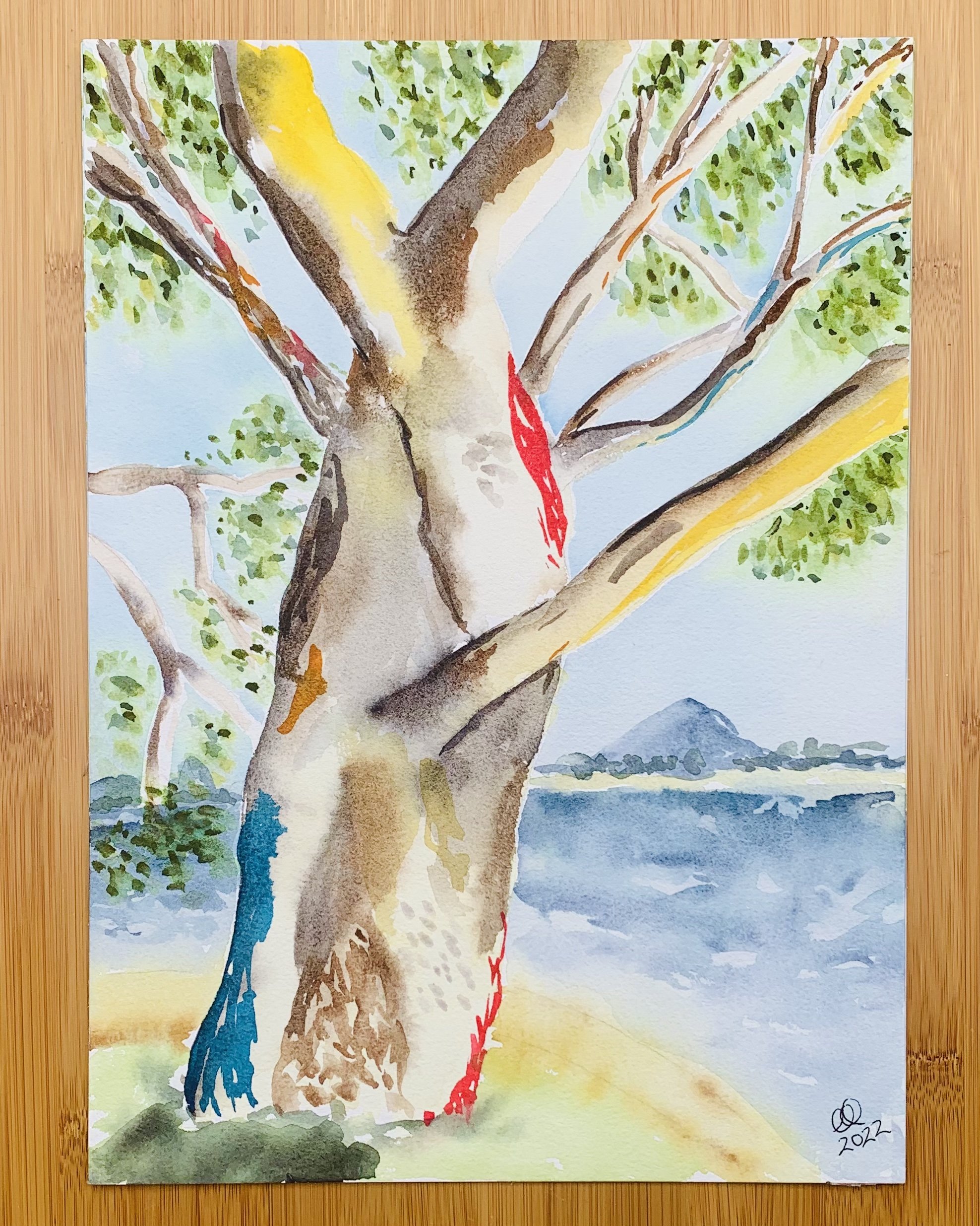
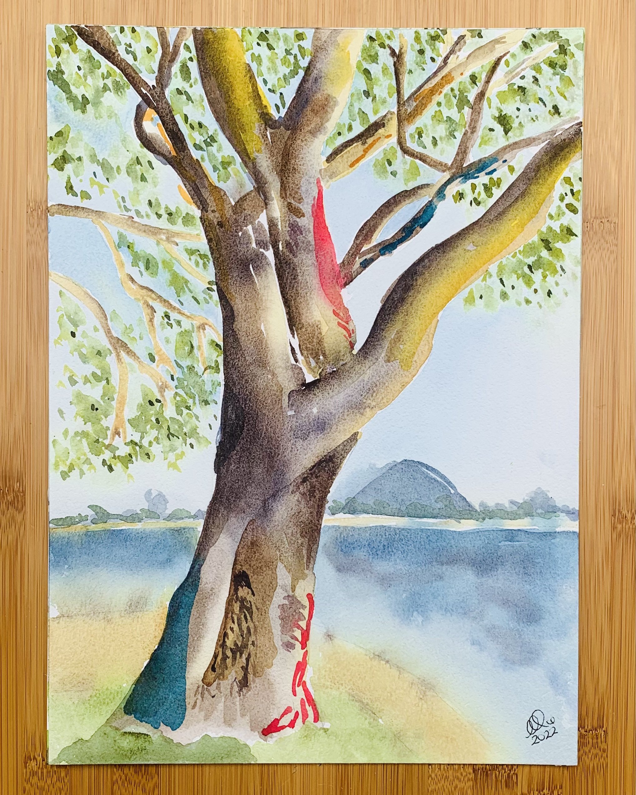
The first picture here is the hot press painting. Second is the cold press. And the third is the rough paper.
Ignore, if you can, the differences in shape in the second picture (my sketchers eye was a bit out that day) and hue in the third image (I had to remix my colours and I underestimated how quickly the rough paper would carry my shadows into the light areas) - and focus instead just on the texture of each image.
You may even want to click each image to open them in a new window to see them in a larger scale.
It’s not that the second and third paintings are bad, it’s just that the texture is different.
Funnily enough, of the second and third paintings I prefer the rough paper, which is interesting because you’d think that if I like the smoothest surface best, then the medium surface would be my next favourite. It just goes to show that sometimes logic plays no part in art appreciation.
Intuition is spoken about a lot in art circles, most frequently in the context of getting into a ‘flow state’ where you’re relying on your intuition and not your brain to make choices. And this is definitely hugely important to making great art.
But I’d love to see it spoken about more in this day-to-day way - being able to listen to and understand your intuition when something isn’t working, and trying the thing that is popping in your brain even if it doesn’t align with the things you’ve learned.
I wonder what would have happened if I hadn’t listened to my gut and bought that block of hot press paper, just to give it a go? Would I have given up painting Australian native landscapes all together, not happy with the results? Would I have felt frustrated and disillusioned with my progress, thinking it was me and my technique that was the problem?
Some of the time - a lot of the time - watercolour is about letting go of the preconceived outcome and seeing the beauty in whatever results you achieve. In looking at the three versions of this painting, I can see loveliness in each version, and I am grateful for that.
But what I’m learning now, in the ‘style development’ stage of my journey as an artist, is that being able to fine tune your materials and techniques to achieve your vision is also important. There can be a sweet spot of control and release that creates magic, and that’s what I’m striving to find.
Have you checked out my new online store? I released 11 originals from my archives, and they’re ready to be packaged up and posted out to decorate your home or office. I particularly love the Blue & Yellow Poppies, and am hoping it finds a beautiful new home soon.